GFA.org Redesign
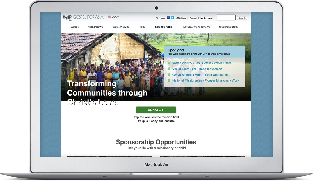
Gospel for Asia's website has been around 20+ years, but had not received a updated design in nearly 8 years.
This needed to be changed for multiple reasons.
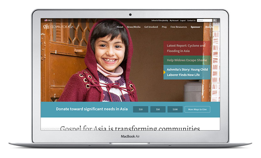
Site Redesign
Gospel for Asia's main website (gfa.org) needed a fresh, new look to gain credibility with a younger audience and to keep pace with user interactions and experiences across the rest of the internet. Another need surfaced, highlighting the reality that the organization's website was custom built by a web developer who was no longer available. New web developers were having a hard time learning the "ins and outs" of the code and valuable man hours were being lost for basic web updates.
Challenge
- Design new, modern, responsive web page layouts that are usable for younger audiences without alienated existing users.
- Develop a web style guide to unify design, user experience and content while increasing organizational efficiency.
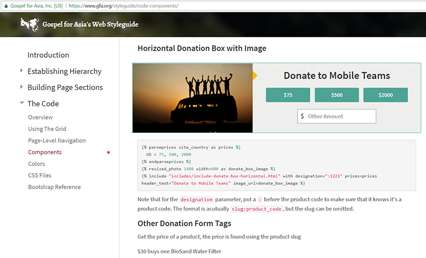
- Document new code structure and design aesthetic that can be adopted by web developers (novice and advanced) from multiple countries.
Solution
The GFA Webteam dove into the website analytics, heatmaps, surveys and comments to better understand the site's information architecture, user journeys, user expectations, traffic sources and general site performance.
Information architecture and navigation structures were rebuilt to accomodate the varying traffic sources
and their differing needs.
Twitter Bootstrap was used to simplify web page development and shorten the time it would take a web developer to learn a new aspect of the website.
Use of large images to connect
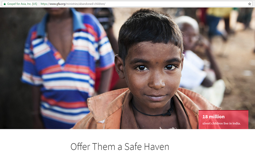
Page templates for layouts and examples
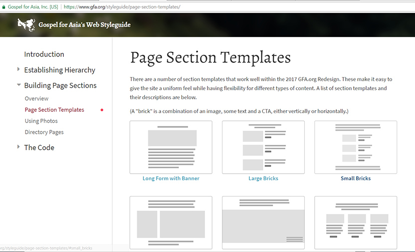
Clear components and code for consistency (say that 5 times fast)
Results
- Overall website user engagement increased by 34% (time on page and page views per visit).
- Webpage load time was cut in half even with more higher quality images.
- Developers, designers and writers had more clarity and a better understanding of web-related projects increasing efficiency and saving time.
Key Takeaways
- Redesigning a site of 10,000+ pages is hard and requires excellent planning
- Don't design around edge cases. Apply the 80/20 rule
- Analytics + user journies tell most the story you need to know
- Bring key stakeholders in as early as possible
- Users don't like change. Make the change gradual if possible
